
Pivot Tables—one of Excel’s most powerful tools for summarizing and analyzing large datasets.
Pivot Tables Tutorial
Goal: Learn to create and customize pivot tables to analyze data like sales, surveys, or inventory.
Part 1: Prepare Your Data
Before creating a pivot table, ensure your data is:
- Structured: Each column has a header (e.g., “Product,” “Region,” “Sales”).
- No Blanks: Remove empty rows/columns.
- Consistent: No mixed data types (e.g., text in a numeric column).
Example Dataset:
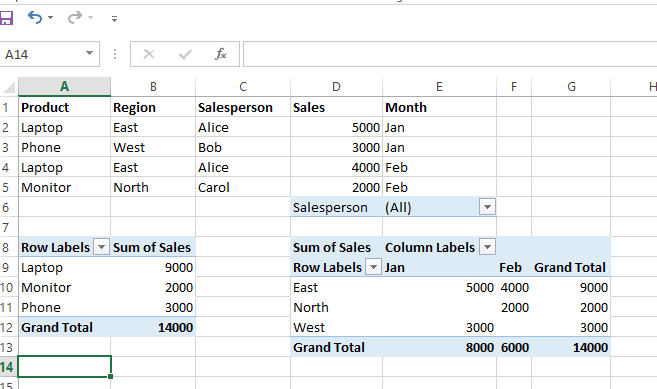
| Product | Region | Salesperson | Sales | Month |
|---|---|---|---|---|
| Laptop | East | Alice | 5000 | Jan |
| Phone | West | Bob | 3000 | Jan |
| Laptop | East | Alice | 4000 | Feb |
| Monitor | North | Carol | 2000 | Feb |
Part 2: Create a Pivot Table
- Select Your Data:
- Click any cell in your dataset (or select the entire range).
- Insert Pivot Table:
- Go to Insert → PivotTable → From Table/Range.
- In the dialog box:
- Confirm the data range.
- Choose where to place the pivot table (new worksheet or existing one).
- Click OK. (Shortcut: Select data → press
Alt + N + V)
Part 3: Build the Pivot Table
The PivotTable Fields pane will appear. Drag fields into these areas:
- Rows: Categories to group by (e.g., “Product,” “Region”).
- Columns: Subcategories (e.g., “Month”).
- Values: Numeric data to summarize (e.g., “Sales”).
- Filters: Optional filters to slice data (e.g., “Salesperson”).
Example 1: Summarize Sales by Product
- Drag Product to Rows.
- Drag Sales to Values.
- Excel will automatically sum sales for each product.
| Row Labels | Sum of Sales |
|---|---|
| Laptop | 9000 |
| Monitor | 2000 |
| Phone | 3000 |
Example 2: Compare Sales by Region and Month
- Drag Region to Rows.
- Drag Month to Columns.
- Drag Sales to Values.
| Row Labels | Jan | Feb | Total |
|---|---|---|---|
| East | 5000 | 4000 | 9000 |
| North | 0 | 2000 | 2000 |
| West | 3000 | 0 | 3000 |
Part 4: Customize the Pivot Table
1. Change Calculations
- By default, numbers are summed. To change:
- Click the dropdown next to Sum of Sales in the Values area → Value Field Settings.
- Choose Average, Count, or Max instead.
2. Add Filters
- Drag Salesperson to the Filters area.
- Use the dropdown at the top to filter by a specific person (e.g., Alice).
3. Format Numbers
- Right-click a value → Number Format → Choose Currency, Percentage, etc.
4. Sort Data
- Click the dropdown next to Row Labels → Sort A-Z, Z-A, or by value.
Part 5: Refresh and Update
If you edit your original data:
- Right-click the pivot table → Refresh.
- To update the data range:
- Click the pivot table → Go to Analyze → Change Data Source.
Practice Exercise
Dataset: A table with columns: Date, Employee, Department, Hours Worked.
Tasks:
- Create a pivot table to show total hours worked by department.
- Add a filter for date ranges (e.g., show only Q1 data).
- Calculate the average hours worked per employee.
Pro Tips
- Group Dates: Right-click dates in a pivot table → Group → Months/Quarters.
- Slicers: Add interactive filters (go to Analyze → Insert Slicer).
- Pivot Charts: Turn your pivot table into a chart (Analyze → PivotChart).
Common Use Cases
- Summarize sales by region/product.
- Analyze survey responses by demographic.
- Track inventory turnover by category.
- Calculate employee performance metrics.
Leave a Reply